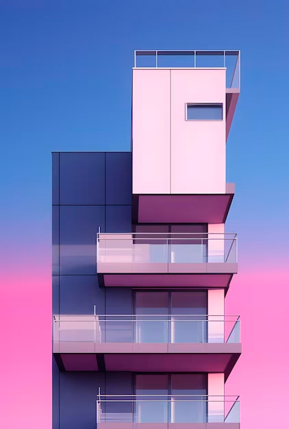
This bold choice contrasts sharply with the previous selections of more subdued tones, reflecting a shift towards more dynamic and expressive design philosophies in contemporary architecture.
The choice of magenta signifies more than just a trend; it represents a broader movement towards personalization and uniqueness in architectural design. Magenta stands as a symbol of bravery and innovation, encouraging designers to explore beyond traditional boundaries and express individualism in their creations.
However, for those who prefer subtler tones, the industry is also seeing a shift towards natural and organic, yet calming colors like mustard yellow, ochre reds, and dusty brick pinks. These colors are not just about aesthetics; they are chosen for their ability to create soothing, wellness-promoting, and characterful environments.
The trend is a response to a growing desire for spaces that reflect individual personalities and offer a tranquil retreat from the bustling world outside.
The selection of magenta as Pantone’s Color of the Year is a bold statement in the world of architecture and design, encouraging a departure from convention. It opens doors to diverse possibilities, from vibrant and lively spaces to more grounded, serene environments. This trend highlights the evolving nature of architectural design – a field increasingly focused on personal expression, emotional resonance, and the well-being of its inhabitants. As architects and designers, embracing this trend means creating spaces that are not just visually appealing but also emotionally enriching.

